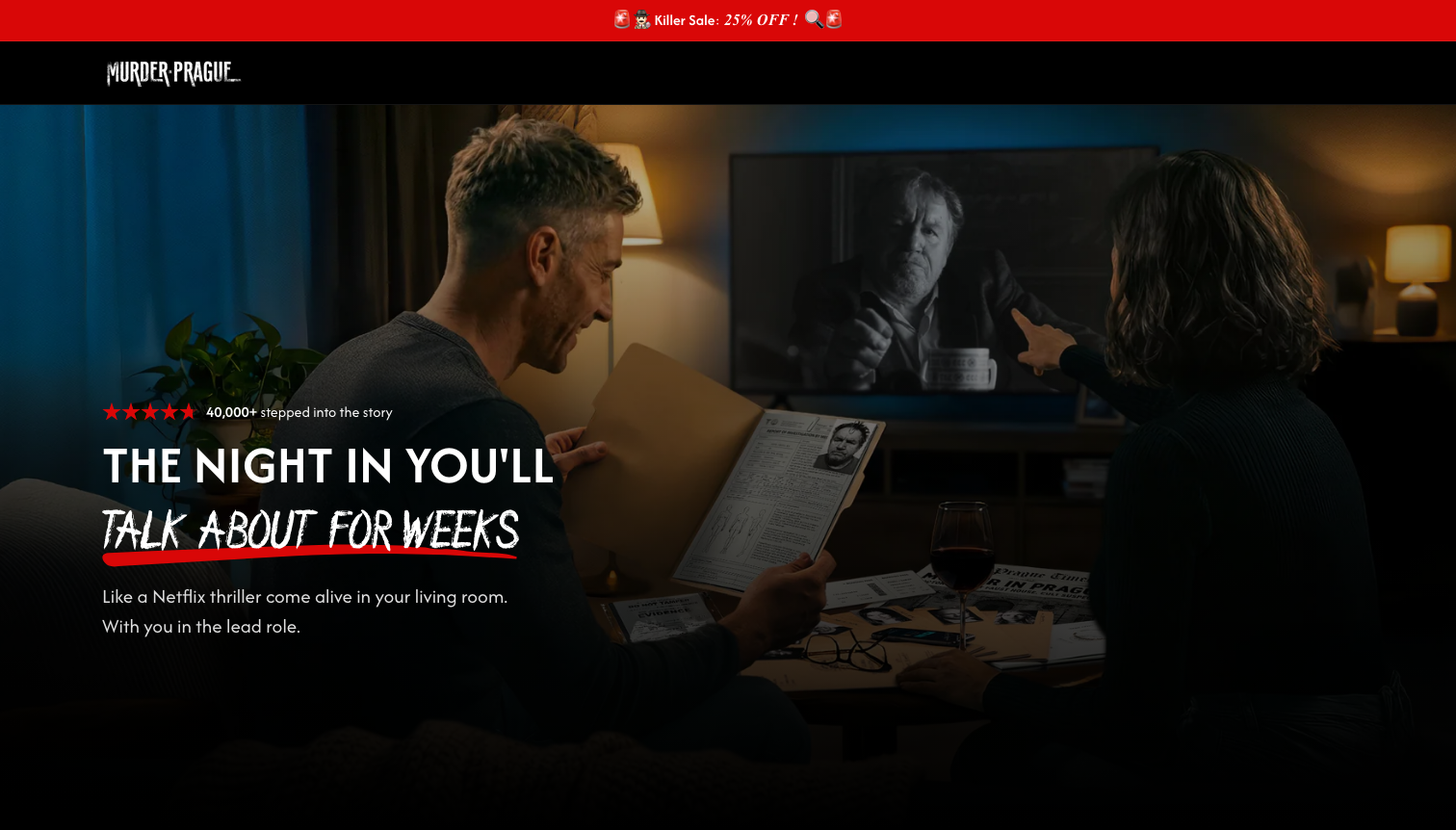
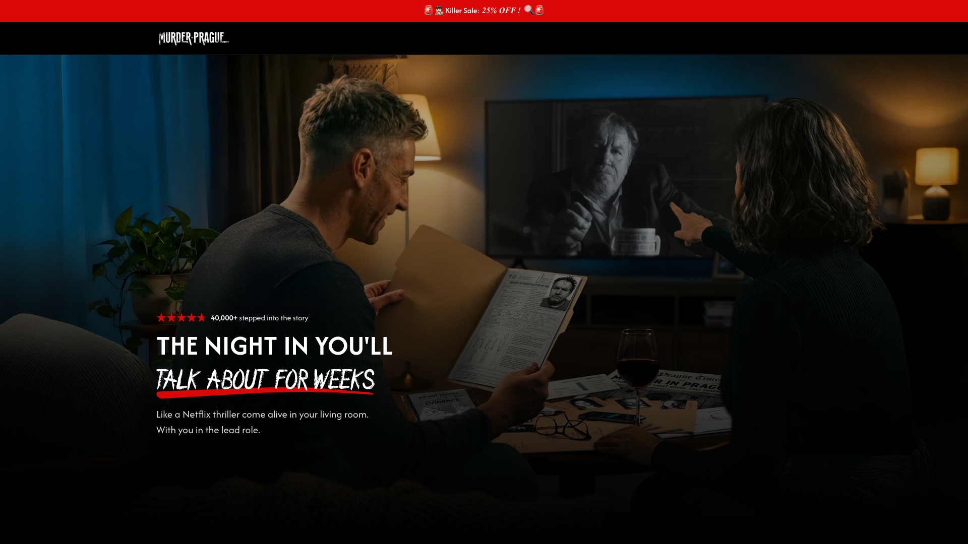
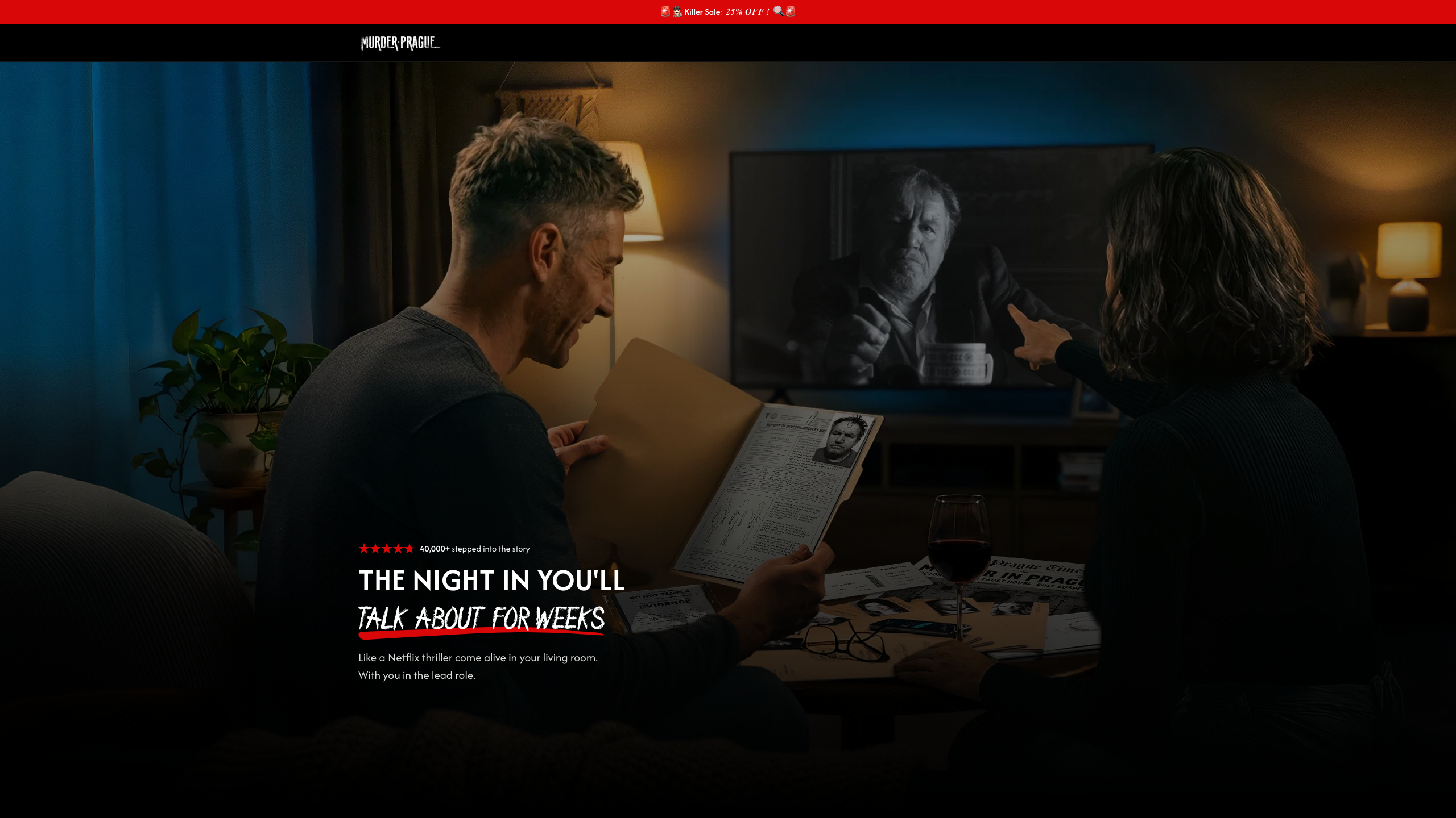
Hero first load: Control vs Variant B, mobile to 2K
Each image is what the screen shows on first load. “B: before the fixes” is Variant B with its stylesheet from before the desktop fixes (what Branko saw). Gap = from the last element of the hero text to the “SUSPECTS ON YOUR TV” heading. Click an image to open it full size. B now: 80px on phones (90px from 420px wide); 140px from 1024 to 1480px; on other desktop sizes the heading starts just below the first screen.
iPhone SE / mini 375 × 548
Control (live)133px gap below the buttonB: before the fixes52px gap below the subheadB: now80px gap below the subhead
iPhone 14/15/16 393 × 659
Control (live)150px gap below the buttonB: before the fixes52px gap below the subheadB: now80px gap below the subhead
iPhone Pro Max 430 × 739
Control (live)162px gap below the buttonB: before the fixes52px gap below the subheadB: now90px gap below the subhead
iPad portrait 768 × 1024
Control (live)110px gap below the buttonB: before the fixes175px gap below the subheadB: now147px gap below the subhead
iPad landscape 1024 × 768
Control (live)110px gap below the buttonB: before the fixes175px gap below the subheadB: now140px gap below the subhead
Laptop 1280 × 800
Control (live)110px gap below the buttonB: before the fixes175px gap below the subheadB: now140px gap below the subhead
MacBook Air 1440 × 900
Control (live)110px gap below the buttonB: before the fixes175px gap below the subheadB: now140px gap below the subhead
MacBook Pro 14" 1512 × 862
Control (live)170px gap below the buttonB: before the fixes235px gap below the subheadB: now207px gap below the subhead
Full HD 1920 × 1080
Control (live)186px gap below the buttonB: before the fixes250px gap below the subheadB: now222px gap below the subhead
2K / QHD 2560 × 1440
Control (live)211px gap below the buttonB: before the fixes276px gap below the subheadB: now248px gap below the subhead